 MAGCULTURE-NEW MAGAZINE DESIGN
BY JEREMY LESLIE
 Reading this book and information about Magazines becoming Magazines have given me the insight to why Magazines are important to our culture-Magazines are at a basic periodic publication- with the combination of text and image created with the team of editors and designers. Magazines may look simple and easy to create but their are important design elements such as; the page size, grid, typefaces and details and all these essentials give the magazine identity and a visual impact. The cover is the most important component of the magazine, The heading has to relate to the image, it has to relate to the text and colours. Many magazines are unsuccessful because they repeat designs that are from magazines that have no relation to theirs, for example the Blah Blah Blah magazine applied the 'ray gun' design onto their front cover but readers were unimpressed and confused by the relation between the experimental pop culture heading and the music themed design.
This has made me understand the importance of layouts and how it connects with the title and theme. I will need to consider my colour palette, font and graphic layout.
ART DIRECTORS
PAUL BOUDENS https://printismint.wordpress.com/2012/07/30/paul-boudens/
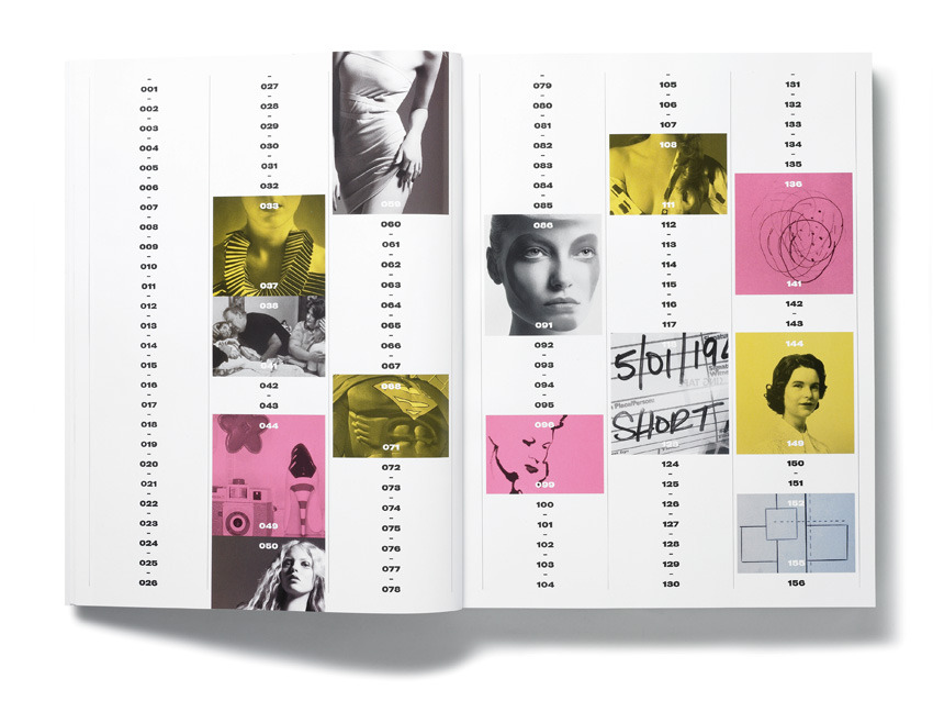
Paul Boudens is a graphic designer and art director who combines his style with the fashion industry. His work relies heavily on the use of materials, he believes his work can’t be created using just a computer alone, so he experiments with paint, stencils and collage, this technique gives his work a certain sensitivity. What engaged me was the contrast between the cool blues and white with the deep red that is stamped confidently.
 This fashion magazine is called A/B/C- their front covers are designed by a single letter but this single letter is the cover for this magazine-there is no legitimate front cover. In a way it makes the readers instantly know which page has this information and what exactly is in this magazine, making it more likely for the readers to read it.
What makes the composition effective is the opposite colours, the warm and deep red balances out by the cool-blue photography. I like the simplicity and modern layout- it gives that graphical and artistic layout. Paul Bouden has an art approach to his designs but is subtle from the minimal design and the clean colours. I am inspired to combine opposite colours because Paul Bouden has demonstrated that opposite colours are alluring against one-another.
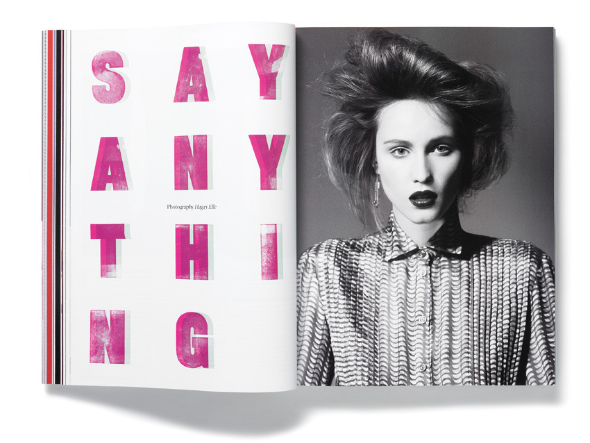
JENNY ENEQVEST http://www.jennyeneqvist.com/
Jenny eneqvest is a Swedish art director and design consultant based in London. Being educated in our generation has made her design much more effective and successful in the social media. Jenny specializes in Typography and content design, giving her the ability to create effective publications, identities, environments, digital projects, and typefaces.
Because of her high level of skill, her role can be stretched from art director to production manager. Her aim is to oversee the visual aesthetic of brandings, Jenny researches the brand to find a concept that would lead her to the final design. She intentionally balances between concept, typography and craft. Her layout and designs have a youthful and almost playful atmosphere. Jenny as well, combines opposite colours that successfully compliment one another.
I found this design the most effective because of the pastel yellow against the monotone. Jenny has balanced out the colours by making the text black to connect with black and white image and making the font almost elegant to connect with soft yellow. Her concepts and intentions have made consider how I use colours together and they will look effective together.
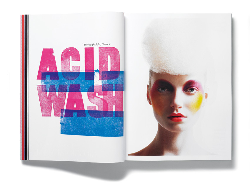
MATT WILEY http://mattwilley.co.uk/filter/Magazine/Port-Magazine


Matt Wiley is a co-founder and senior editor of Port Magazine. Matt is on the board of the Editorial Design Organisation and is the Vice Chairman of Typography Designers. His work is very clean and defined. Matt creates the layout with a white background and hinting with vibrant colours. What I like about his work is that it is graphical, he gives brief messages on a single page which makes the layout design and context to the point. The slight design gives it that contemporary factor to the magazine. Matt attracts the readers by the simple photography, as if he wants the viewers to just focus on the model and that one message. It gives the readers that opportunity to think about the page and to actually appreciate the whole layout instead of just the photo. The whole composition of this magazine has a professional sense by the blank backgrounds- this has helped me understand when I have used enough colour on a page.
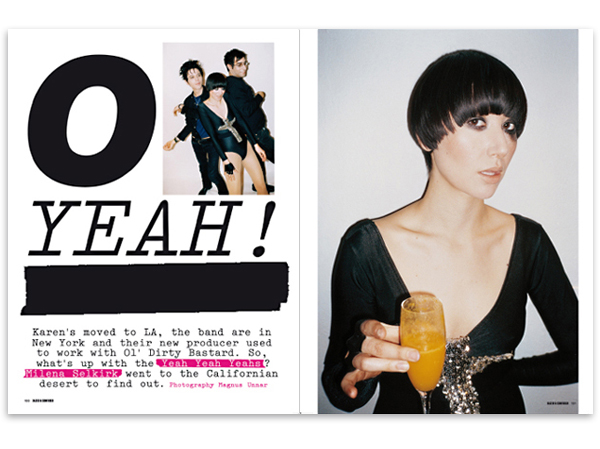
GRAHAM ROUNTHWAITE http://www.grahamrounthwaite.com/
 Graham Rounthwaite specializes in music, fashion and advertising industries. These specialisms have made Graham in influential Art Director, Designer and Illustrator. He has a self-evident insight into the youth culture and the ability to create covers that are commercially successful. He has worked for magazines such as The Face, Trace, America Magazine and I-D and also produces fashion illustration. Graham always researches and refines concepts that is accurate for each individual client.
His artwork has become influential and has defined a genre in the modern illustration industry. The i-D magazine is a high-end, Indie Magazine.
What I like about his layout is that it is young but timeless. He has continued with theme of the wink on each front cover – a graphic representation of the magazine’s logo – have become integral to the i-D identity. Over 300 of the world’s fashion elite, the great and the grounded, have given i-D a cheeky wink, from the likes of Madonna, Tom Ford, Chloë Sevigny, Björk, Tilda Swinton, Drew Barrymore, Lil’ Kim, Naomi Campbell and Kate Moss. I love the idea of having that unique logo to identify the magazine- it makes the cover more fun and almost being included in this memorable 'wink'. This magazine is important in our generation because its how we can know what's going on our youth. I would like to have a unique logo much like this, i think it will bring the magazine together and make it exclusive.
I think smiling or giving a bold smile may be a possible logo. I want my photos to be original, fun and genuine, this logo may give that youthful response.
PETER STITSON https://printismint.wordpress.com/2012/07/26/peter-stitson/


No comments:
Post a Comment